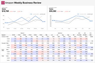
How to Measure Your Business the Amazon WayCollaborative article between Dmitry Anoshin and BI Bites 🍪. Subscribe to our newsletter so you won’t miss any cool stuff!Mar 11Mar 11
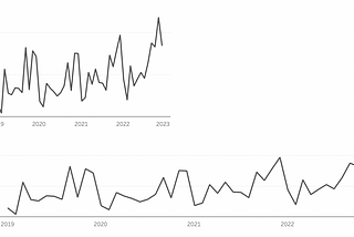
Why You Should Always Visualize Your Data First?🦖 Explained with dinosaurs why charts are better than just statsSep 12, 2024Sep 12, 2024
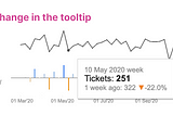
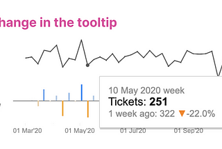
Tooltips in DashboardsTooltips — are small boxes that appear when you hover over an element. Tooltips are always attached to specific items, such as a dot on a…Jul 21, 2024Jul 21, 2024
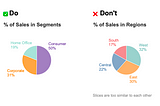
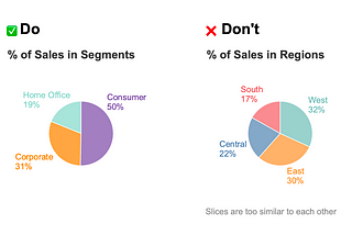
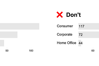
Pie Charts Best PracticesIn my second year of university, I was told that you can’t use pie charts. It was simply not allowed, and that’s all. The reason given was…Jul 13, 20241Jul 13, 20241
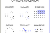
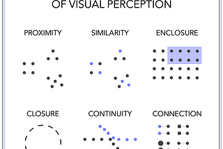
Gestalt Principles in Data VisualizationA bit of history: The gestalt principles, developed by German psychologists in the 1920s, aimed to unravel the complexities of human…Nov 24, 2023Nov 24, 2023
Line Charts Best PracticesLine charts are one of the most popular charts in the world of data visualization. They have an ability to convey data without the need for…Nov 5, 20231Nov 5, 20231
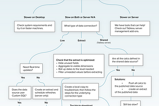
How to increase Dashboard Performance in TableauThere is a great whitepaper by Ben Bausili and Mat Hughes“Designing Efficient Production Dashboards” about best practices for creating…Feb 4, 20231Feb 4, 20231
Советы по улучшению перфоманса дашбордов в TableauЕсть такой материал у Tableau “Designing Efficient Production Dashboards” от Ben Bausili и Mat Hughes про лучшие практики для создания…Feb 23, 2022Feb 23, 2022
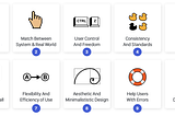
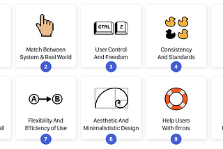
10 UX эвристик и дэшбордыРешила тут применить 10 UX эвристик Якоба Нильсона к проектированию дэшбордов. Эвристики известные, классные и применимы к разного рода…Aug 27, 20211Aug 27, 20211